
The artistry of film-making is about more than just capturing a compelling story or brilliant performances; it is about employing a treasure trove of visual cues to communicate emotion, create atmosphere, and guide the viewer’s attention. One of the most powerful, yet subtle tools in a film director’s kit is color. The psychology of color, deeply rooted in our human perception and cultural associations, can be skillfully used by film colorists to solidify the overall narrative and specific thematic elements of a film.
«Color in film is a judgement call – it’s up to the individual. It’s a way, along with the art direction, the casting, the music, the editing, and the photography, of making a film more personal…» – Martin Scorsese
Beyond painting an attractive picture, understanding how colors interact with each other, and with the audience, can help tell a story in a more engaging and immersive way. Let’s delve into the depth of color psychology and its application in film making through the lens of a film colorist.
Table of Contents
- The Psychology of Color: A Primer
- Impact of Color on Storytelling
- Color Schemes in Film: An Exploration
- Case Studies: Iconic Use of Color in Film
- Working with a Film Colorist: Best Practices
- Conclusion: The Power of Color in Film

1. The Psychology of Color: A primer
Color, one of the most nuanced elements of artistic expression, when mastered, can greatly amplify the emotional gravity of a film. Research in the field of psychology has provided deeper insights into the correlations between color and human emotion, which becomes an essential tool for directors and colorists.
Perception of color is influenced by a variety of factors. In a nutshell, color psychology is the study of how colors impact our cognitive processes and behaviors. While interpretations can be quite subjective and differ among cultures, some universal associations have been noted. For instance, red is typically associated with intensity, ranging from love to anger. Blue, on the other hand, is linked to calmness, intelligence, and sadness, among other sentiments. Yellow often represents joy or energy, while green denotes nature, tranquility, and sometimes jealousy.
However, color interpretation is not as straightforward as it seems. For instance, while black often symbolizes darkness or mystery, it can also stand for elegance or sophistication. These dual meanings can lend additional complexities to a film’s narrative, thereby pushing directors and colorists to think creatively about their choice of colors.
Black and white films, while void of color, still play a huge role in their reference to color. For instance, the grayscale range in such films adds depth and dimension, often symbolizing a struggle between good and evil. Similarly, the “black & white in color” technique that uses desaturated colors can portray a dreary or nostalgic tone.
It’s important to remember that the psychology of color is not a clear-cut science but a continuously evolving field that respects individual and cultural differences. Therefore, film directors and colorists should use these general understanding as a guide but also trust their intuition and artistic sensibility when using color for storytelling.
2. Impact of Color on Storytelling
Colors wield a profound influence on the narratives that films present. To begin with, color sets the emotional undertone of scenes and sequences, subtly manipulating viewers’ emotions toward the perceived plot developments. For example, a scene doused in blue hues may denote melancholy or tranquility, while one blanketed in red shades may symbolize passion or peril. Thus, film colorists carefully select color palettes linked with specific emotional responses to enhance the narrative’s emotional resonance.
Furthermore, color serves as a narrative technique to delineate characters or signify their changing dynamics. Directors and film colorists often utilize specific color schemes to characterize roles in a story. Their choice of colors may either be literal, such as green for jealousy, or symbolic, like using light to indicate a virtuous character, and darkness to represent a villainous entity. Additionally, color is typically employed to denote changes in characters or situations, using shifts in color palettes to signify evolution or transformation.
The role of color in establishing and amplifying settings, eras, or moods is also significant. The color scheme of a film often reflects its socio-cultural context and period, adding layers of context and depth to the saga. By saturating scenes with warm or cool tones, filmmakers can evoke a nostalgic or futuristic ambiance respectively. Similarly, by implementing appropriate color grading, film colorists can emulate the visual aesthetics of various eras, from the faded, sepia-toned images of the past to the vivid, high-contrast visuals of futuristic narratives.
In summary, the art of color grading extends far beyond aesthetic considerations; it plays a pivotal role in driving narratives, shaping audience perceptions, and enhancing storytelling effectiveness. Hence, the color palette is not merely an ornamental aspect of films, but rather an integral narrative tool that shapes the viewers’ cinematic experience.

3. Color Schemes in Film: An Exploration
Before delving into the specific techniques employed by film colorists, it must be noted that the color palette used in a film is central to its visual storytelling. Film colorists work closely with directors and cinematographers to ensure chosen color schemes dovetail with the narrative and the intended emotional response from the audience. The industry prominent color schemes incorporate monochromatic, analogous, and complementary colors. Each of these schemes offers a distinct impression and tone, serving to emphasize or underpin various elements of the plot or characters.
- Monochromatic Color Scheme: This style employs varying shades, tones, and tints of a single base color. It creates a consistent and aesthetically pleasing visual effect. By placing the viewer in a focused and controlled emotional environment, the monochromatic color scheme allows for minimal visual distractions, thereby allowing the film’s narrative and character development to take center stage.
- Analogous Color Scheme: This entails the use of colors that are adjacent on the color wheel, thus producing a harmonious and cohesive look. They create a visually warmer or cooler image, depending on the colors chosen. This subtle gradation can help underscore the narrative progression or highlight key thematic elements within the story.
- Complementary Color Scheme: This refers to the use of colors that are directly opposite each other on the color wheel. It is known for creating a vibrant and dynamic aesthetic, especially when the colors used are at their full saturation. Treating two narrative points with dramatically opposing emotional states, or outlining ‘good’ and ‘evil’ characters are notably facile with the use of complementary colors due to their inherent contrast.
- Triad color scheme: This type of color scheme harnesses the power of three colors that are evenly spaced around the color wheel. The colors used typically include a dominant color, which provides the overall tone of the scene, and two supporting colors used to highlight details and create visual interest.
- Tetradic color scheme: This color scheme employs four colors arranged in two complementary pairs. Contrary to more subdued schemes, the tetradic approach often generates a vivacious and dynamic palette that highly instrumental in establishing a vibrant ambiance within a scene. However, properly balancing these colors can be a meticulous task that requires a solid understanding of color relations and meticulous attention to create harmony, preventing any single color from dominating over others. Colorists using the tetradic scheme must strike a fine balance, ensuring each color shines without diminishing the overall impact of the scene. This arrangement brings exuberance and life to the scene, often creating a high-energy atmosphere that can be used by film directors to introduce excitement or innovation into their narratives.
- Tetradic color scheme: This color scheme employs four colors arranged in two complementary pairs. Contrary to more subdued schemes, the tetradic approach often generates a vivacious and dynamic palette that highly instrumental in establishing a vibrant ambiance within a scene. However, properly balancing these colors can be a meticulous task that requires a solid understanding of color relations and meticulous attention to create harmony, preventing any single color from dominating over others. Colorists using the tetradic scheme must strike a fine balance, ensuring each color shines without diminishing the overall impact of the scene. This arrangement brings exuberance and life to the scene, often creating a high-energy atmosphere that can be used by film directors to introduce excitement or innovation into their narratives.
4. Case Studies: Iconic Use of Color in Film
Delving into the realm of cinematic color usage, one finds a plethora of examples wherein discerning film directors and colorists have ingeniously employed color to evoke specific emotions, enhance narrative elements, or highlight significant motifs. This section discusses some salient incidents from celebrated movies, which have made iconic use of color in filmmaking.
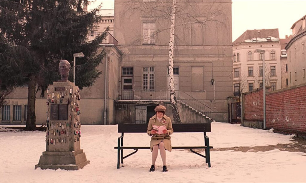
For instance, consider the film titled ‘The Grand Budapest Hotel’ curated by Wes Anderson. Notably, Anderson’s use of color is obsessively meticulous and purposeful in his directorial pieces. Throughout this particular film, Anderson employs a pastel-color palette to create an air of nostalgia and a warm, inviting atmosphere that paradoxically underscores the darker themes hidden within the story’s core.
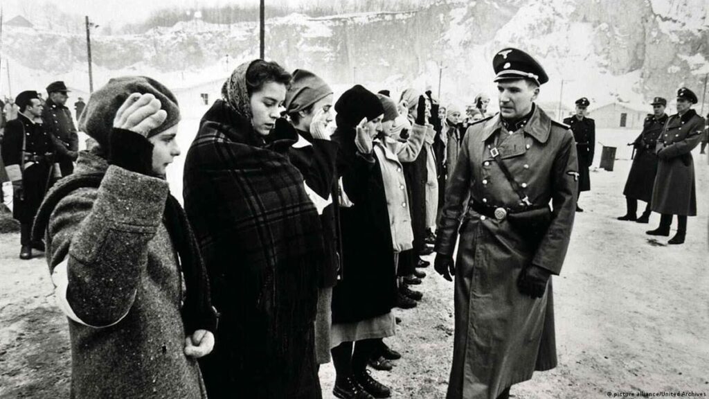
Taking another example, the movie ‘Schindler’s List,’ directed by Steven Spielberg, predominantly uses a black and white color scheme, reflecting the grim realities of Holocaust-era Poland. However, Spielberg punctuates this bleak tableau with a splash of color in a single scene involving a little girl donning a red coat. This striking use of color makes the image etched in viewers’ minds, representing innocence amidst chaos and eventually amplifying the horror when her colored coat is spotted in a pile of discarded clothes.
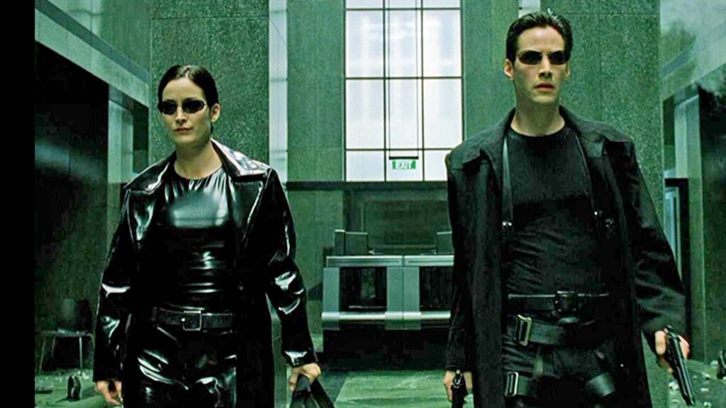
Next, let’s shift our focus onto ‘The Matrix,’ a film directed by the Wachowski siblings. Here, they effectively use the colors green and blue to serve as a dichotomy, symbolizing different realities. The Matrix world is shown in a green-tinted hue symbolizing the artificial and distorted reality created by computers, while the real world is shown in a blue hue, symbolizing a sobering, harsh truth.
In conclusion, it can be said that the subtle manipulation of color palette in films is not an arbitrary choice, but a carefully crafted strategy utilized by directors and film colorists. The above-cited case studies exemplify how profoundly a film’s use of color can resonate with an audience, influencing their perceptions and emulating the intended emotions, adding depth and richness to an already compelling narrative.
5. Conclusion: The Power of Color in Film
In sum, the power of color in film cannot be overstated. It introduces an additional layer of complexity and depth to the cinematic narrative, enhancing its visual appeal while subtly influencing the emotions, perceptions, and reactions of the audience. From the initial stages of structuring the narrative to the meticulous art of color grading, the choices regarding color can be a significant determinant of a film’s success or failure.
By incorporating the psychology of color, film directors and colorists can foster specific viewer responses, set the mood, underscore a theme, or accentuate a character’s personality. In this regard, color serves as a non-verbal form of communication and is an integral component of the film’s mise-en-scène. Its strategic use can elicit a more profound and personal connection between the viewer and the work, thereby enhancing the overall cinematic experience.
Be it through the vibrant color palette enhancing the surrealism of a fantasy landscape or the bleak hues reflecting the desolation in a post-apocalyptic world, the role of color schemes in film is evident. This is further solidified by the iconic use of color in some of the most notable films, proving that the judicious use of color can imprint lasting images in the viewer’s mind, heightening the film’s emotionality, and ultimately solidifying its status in the annals of cinematic history.

For this reason, it’s vital for film directors and colorists to collaborate efficiently, employing best practices to ensure the color choices directly correspond to the film’s narrative, characters, themes, and overall aesthetics. A clear understanding of the psychology of color, along with the technical prowess of a skilled colorist, can result in a visually arresting film that resonates deeply with audiences.
Concisely, color in film is not merely decorative—it’s an indispensable storytelling tool, offering an array of possibilities to those who dare to explore its depths. Understanding and harnessing the power of color can set a film apart, elevating it from merely good to truly great.